NPS (30) – Evaluating text analytics software – 30th article in a series on the Net Promoter System®
Welcome to the 30th article in my series on the Net Promoter Score and System. This is by far the longest and deepest of the set. It includes an example of a real-world analysis and selection done a couple of years ago. The focus was free software, including software that had free trial versions. My daughter (who also designed the covers of the first three books) did the project as part of her bachelor’s degree program. The important part of the project is the selection principles she used. Software has moved on somewhat since then and at least one of the programs she compared no longer exists. Nevertheless, I believe the selection criteria are still valid today and can be used just as well for commercial software. And of course if any software provider mentioned below would like to provide an update, that would be most welcome.
You can read all of the prior articles in the NPS series on our blog page here.
Introduction
The great advantage of the NPS feedback format is that it is short, with a rating question and one or two other open questions. Like most survey types, the purpose is to find out what customers care about and what you need to improve. The main challenge of the open text response format is the need to analyze what people have written, ideally without any human bias. I would like to cover some general principles about using text analytics software, then present a real-world case where such software was analyzed as part of a business school degree course. The overall intent is to provide you a way of comparing and selecting software for your own use. There is no single universally-correct answer. Your answer will depend on factors like volumes, languages and budgets, among others.
General principles about text analysis software
Here is what I believe text mining and analysis software must be able to do, with increasing levels of difficulty as shown below the bullet list. Software should be graded in each area:
- Accept inputs in a variety of formats such as Excel, SurveyMonkey, SalesForce, .csv, video and audio files and so on. The more the better.
- Recognize inputs in a variety of languages. Again, the more the better.
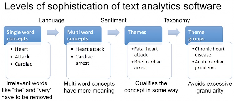
- Identify concepts in a meaningful way. There are four levels:
- The first is simple word frequency, with no filtering. Words like ‘the’ or ‘very’ could come up.
- The second recognizes nouns and discards articles and conjunctions. ‘Heart’ and ‘Attack’ would be separate topics at this level.
- The third level is multi-word topics, such as ‘Heart Attack’ or ‘Cardiac Arrest’.
- Finally, words that mean the same thing need to be grouped into a single concept. For example, “support website” and “support webpage.” This avoids long lists of concepts.
- Identify sentiment to determine whether respondents refer to a concept in a positive, negative or neutral way. Sentiment analysis determines which attributes a customer associates with the concept.
- Identify themes by combining concepts with sentiment and/or linguistic analysis. ‘Fatal heart attack’ or ‘Disgusting undercooked food’ might be themes. ‘Bad food’ is a different theme to ‘good food’. This last example illustrates why simple word frequency software is not useful for survey analytics. Just getting the word ‘food’ a lot will not tell a restaurant owner much.
- Group similar themes to avoid excessive granularity. ‘Serious heart attack’ and ‘Major cardiac arrest’ are grouped together in this step. It may involve use of industry-specific libraries or taxonomies. Some software is delivered with such libraries or lets you add your own. Other programs use data-driven approaches to determine similar words based on how your customers use them in a sentence. Google, for example, uses data-driven Natural Language Processing to make sense of your search queries.
- My experimentation so far has shown that correct handling of pronouns turns out to be very difficult indeed for software, remaining easy for humans. More on the problem later.
State of play in early 2017 – The principles still apply
What follows is an example of an actual comparison and evaluation of analytic software. The software evaluated was for a specific need and had to meet specific criteria. Your needs and criteria will be different. It does get somewhat technical. You may like to just skim over it, or jump straight to the results at the end of the article.
My daughter Claire did a business school project about text analytics for Net Promoter Score surveys in mid-2016. She got permission to survey all business school students, then used a wide variety of software to analyze the text responses, comparing them with human analysis. The survey was a classical NPS survey. She used SurveyMonkey to send it, and there were three questions, plus demographics.
The questions were “How likely are you to recommend the business school to someone choosing their third-level studies?” “Why?” and “What should the business school improve?” She resisted attempts by others to add rating questions, and the survey results validated this resistance. One of the top suggestions was something that would never have come up using a closed survey.
Overall objective of any survey analysis process
Unless you are only interested in tracking a metric, for example to reward people, the fundamental purpose of any survey analysis is to find out what your top improvement priorities should be. The winner of any comparison should therefore be the process or tool that answers that question. The advantage of software over humans is that the only bias is that caused by the programmers. I admit that such bias can be considerable, particularly when selecting the algorithms to be used to categorize text.
A hard historic lesson on decision criteria
In all scientific experiments, it is critical to set up the methodology before you have any data. This was made very evident by changes in US rules on drug approvals. Experimenters are now required to provide details of the exact methodology and data analysis process before they start clinical trials. The results have been dramatic. If you go back 40 years to when researchers could decide how to run the analysis after they had the data, over half the trials were successful. Now the success rate is just under 10% , as people cannot remove data or change their analysis after the fact because the results do not suit them.
The seven-country study farce that affects our lives today
The most famous study that suffered from post-hoc adjustments was the legendary and highly influential ‘Seven countries study’ by Ancel Keys on the relationship between diet and heart disease by country. The study was done in 1958 and continued for 50 years. It showed a directly linear relationship between saturated fat consumption and heart disease. In 2009, Robert Lustig found that Keys had cherry-picked the seven countries from a data set that included either 21 or 22 countries. He apparently discarded the data from the 15 countries that did not support his theory. A separate piece of work also showed that Keys’ results could be better explained by differences in sugar consumption, which Keys had not studied. There is a nasty history of scientists who took positions opposing Keys losing their research funding and even their jobs.
Decision criteria for text mining and analytic software
The people at Sift, now called Keatext , produced a nice eBook on how to select this kind of software. There is a danger of bias here, in that their own software naturally meets their own criteria. For her study, Claire decided to use some of the Sift criteria, deciding that there were a few factors that did not matter much. The result of her work was these decision criteria:
- The ability to access, read and extract words in common file formats and in multiple languages.
- Show how often topics occur.
- Ability to attach sentiment to topics in a useful way. Useful means that it is easy to understand what the sentiment refers to.
- Ability to group similar topics together, even if the words are somewhat different. This is what allows you to summarize the actions that need to be taken from a survey.
- Ability to refine the selections for reporting purposes.
- Nice graphics and other features that make presenting the results easy.
Each item was scored on a 1 to 6 scale with 6 being the maximum. What can I say? The Swiss education system grades this way, so the scale was natural for her.
Scope
All software analyzed had to be either free or available in a fully featured trial version, and all had to at least claim to be up to at least some of the task. This led to some notable exclusions, especially commercially available text analysis solutions which we discuss in the next chapter. The trial version of Watson does not do text analytics. She was unable to find NPS survey analytics examples for IBM’s BlueMix software on Github or the IBM site. Here is the list of solutions that are described in more detail below:
- Humans
- Data Cracker
- WordyUP
- Wordclouds.com
- Keatext
- SurveyTagger
- Etuma Feedback Categorizer
- SPSS (from IBM)
- Lexalytics
- MeaningCloud (Excel Plug-In)
- Text2Data (Excel Plug-In)
- Haven OnDemand
Humans
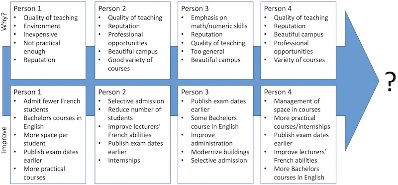
With all their defects, the baseline for all comparisons was human beings. Some students were asked to scan the survey responses and group the ones they felt to be the most important. Human bias emerged quickly. One of the students looking through the improvement suggestions was French. Several people (presumably trying to be funny) had suggested that fewer French students should be allowed to attend the school. The French student going through the responses insisted that this was the most common suggestion. It was not, and did not appear on the lists given by other students.
Nonetheless, the students were reasonably consistent. Among the reasons for ratings, humans picked the quality of the education as the top reason, followed by the beauty of the campus. Some software agreed. The consensus of the human analysis was that the top suggestion by Promoters, Passives and Detractors was to announce the exam dates earlier. No software available without charge identified this as the top improvement suggestion. Survey responses were mainly in French, with some in English and just one in German. The humans understood all three without difficulty. Priorities for the why and improve questions are shown for the first four humans.
Humans don’t scale well
This is one area where the results of the business-school survey may differ from more common needs. The small number of responses meant it was realistic to ask humans to do the analysis. If your needs involve tens of thousands of lengthy responses, using people to do the analysis will be difficult. Humans can review about 15,000 words an hour, and the quality of the work goes down as they get tired.
Main challenge when humans help software
Generally, tagging responses to manually categorize them introduces human bias and is not a good idea. In one part of HP, tagging support survey responses worked well until a second person was needed to handle the volume. Since the two did not agree on the categories, trend data was disrupted. Adding a third person made it worse. You can make manual tagging work if you invest in training.
Here is what humans can do that no software can as yet
Humans can handle pronouns and understand context. Let’s consider pronouns first. No software tested could handle pronouns correctly. Take this unrelated example. “The cat walked into the room. It was empty.” No software tested could identify what the ’it’ was. While it might seem simple to write code to force the software to revert to the prior noun whenever it encounters a pronoun, there are many exceptions to this rule. This brings us to the second thing that does not present any difficulty for humans. Take this example. “The cat walked into the room. It was fluffy.” Humans know that fluffy almost certainly refers to the cat rather than the room.

Humans are good at recognizing and adjusting for context. Both humans and software would be confused by “The cat walked into the room. It was dirty.” Good grammar suggests that the room was dirty, but it is difficult to be certain. I suppose this is one of the challenges that Natural Language Processing software will need to address in the future.
DataCracker
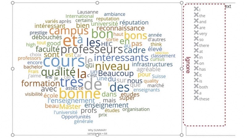
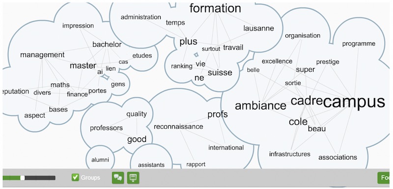
DataCracker is available at www.datacracker.com. It is free for surveys with up to 100 responses. It works by looking at individual words. It is not able to identify multi-word topics or concepts. It is probably the software that is able to import data from the widest variety of formats. The business-school survey had over 250 responses, so the full set of answers could not be loaded into the free version of the software. You can see a screenshot of the main text analysis view below. It is a typical word cloud, with font size indicating relative frequency. Since it does not understand language, irrelevant words like “la”, “les” “très”, “et” and so on come out frequently. (The, the, very, and). As with all word clouds, you can see in Exhibit 9.3 that “interesting” is a common word, without any indication of what exactly is interesting. Unlike WordyUp and Wordclouds.com, you can ignore words by clicking them on the list on the right. This of course allows you to bias the results in any way you like.
WordyUp
WordyUp goes beyond the basics of word clouds by showing the relationships between different words. However, the free version at wordyup.com is limited to 500 words. The central challenge the software faces is the same as for many word clouds: irrelevant words like ‘because’ take priority if they occur frequently, as shown below. At least in the free version, there is no way to exclude any particular word. The only form of data entry is to copy text into the appropriate box on their website. The sample below is from 500 words that were responses to the “Why?” question in the survey. The grouping of words about the campus is well done. Groupings for the improvement question were far less useful.
Wordclouds.com
For pure simple and free artistic word clouds, it is hard to beat wordclouds.com though Wordle produces similar results. Wordle and Wordclouds.com are so similar that it was not useful to include both in the analysis. The software works on any device that can display HTML. The output can be displayed in a variety of attractive shapes. It treats ‘Good’ and ‘good’ as two different words. Words can be excluded manually. You need to exercise caution when using the control slider to resize the cloud, as differing words are excluded from the cloud depending on the size of the graphic you choose to display. Some of the most popular words are excluded in some formats, and there is no apparent reason behind the choices. Words can be excluded or added manually, and the weight of each word can be modified. Exhibit 9.5 shows the output using an English translation of the “Why?” responses.

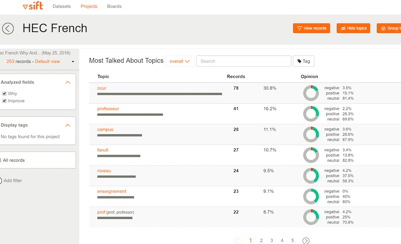
Keatext
Keatext is another cloud-based solution. A fully functional 14-day trial is available at www.keatext.ai. The software does sentiment analysis. It ranks words by frequency and shows the positive, negative and neutral sentiment proportions using an attractive graphic format. Clicking on any of the circles on the right takes you to a diagram that clusters words that have been used together with the word in question. It does limited word grouping. In the screen capture below I suppose the fact that ‘professeur’ was in French prevented it being grouped with the similar words at the bottom of the table.
For NPS surveys, you can select the question you want to analyze, and can filter using demographic fields. Excel was used as the input format for this study. The software only works correctly in English, as it cannot display accented characters, at least using Chrome. Overall, Keatext is a nice improvement on word cloud software. It is Natural Language Processing software and it is constantly being improved. In my opinion, the most important next step would be to improve the ability to extract multi-word topics.
SurveyTagger
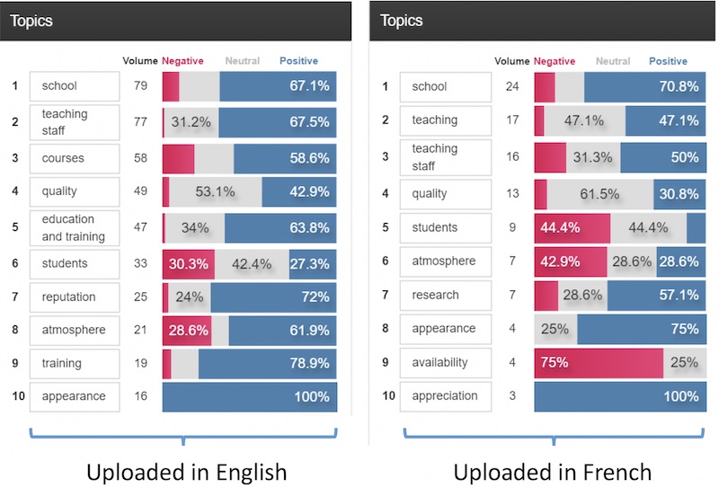
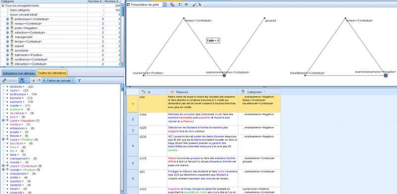
SurveyTagger is no longer being developed as Etuma is concentrating on their enterprise solution, Etuma Feedback Categorizer. (See the additional paragraph on the new software below.) The software is an evolution of earlier software used to manually tag survey results. SurveyTagger tags automatically and works in many languages that use western character sets. Since the authors are Finnish, I suppose they realized they needed to get beyond Finnish to be successful. No matter what the input language, the results are displayed in English, as shown below. There are differences in analysis due to translation. As mentioned, we translated the survey results into English for software testing. The diagram below shows the analysis of the “Why?” question when the input was in English and in French. Note that there are at least some multi-word topics, though not many. Actual survey responses can be shown below the graphs. You can drill down a little by clicking on an individual item.
Etuma Feedback Categorizer
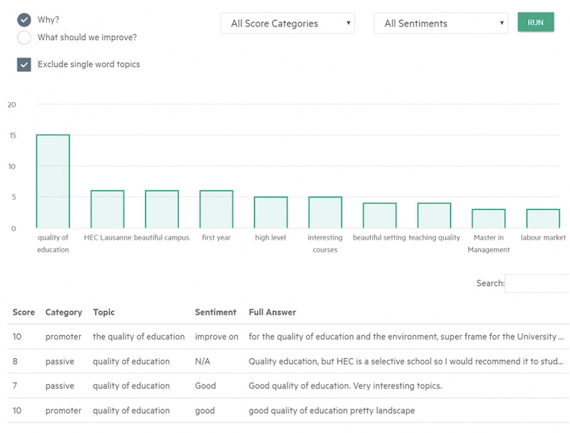
While it is not immediately obvious that it is possible to try out this new software for free, it can be done by sending your file to Etuma. (The software was tested after the business-school project was completed, so has not been included in the results table.) They have taken what they learned from Survey Tagger and applied it to this more sophisticated solution. The software does what it claims, namely categorizes survey feedback. It adds some useful elements to the categorization.
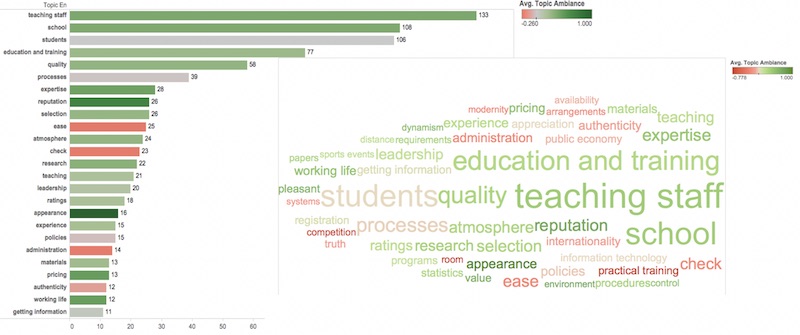
In the first view in Exhibit 9.8, you can see the Promoter / Passive / Detractor NPS status of people who have mentioned each topic. In all views, the issue with single-word topics remains evident, especially compared with the human analysis shown above. The whole subject of the beauty of the campus on the shores of Lake Geneva does not really show up. ‘Appearance’ is there, but appearance of what?
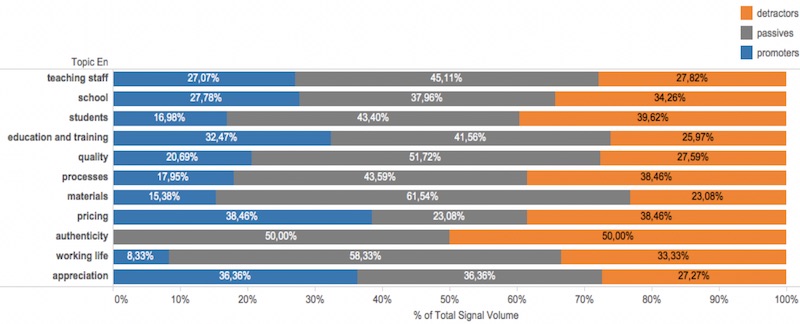
A nice touch in the Feedback Categorizer is the new ‘Ambience’ view. It provides a sentiment-based graph making it easy to know whether a topic has been mentioned in a positive or negative way.
The same data is used for the word cloud view that is combined with the Ambience bar chart shown above.
SPSS Text Analysis for Surveys
IBM acquired SPSS a few years ago. SPSS is generally viewed as the premier statistical analysis software. As you might expect, their SPSS Text Analysis for Surveys software is detailed and complete. Perhaps too detailed and too complete for most people, as shown in Exhibit 9.10.
The trial version works in English, is fully functional and can be downloaded from http://www-03.ibm.com/software/products/en/spss-text-analytics-surveys.
SPSS comes with several taxonomies and these are essential to the correct grouping of topics. There was no education taxonomy in the trial version, so the brand image data was used instead. There are lots of options. Their website explains how to drill down into categories and combine them manually. It is possible to export the results into SPSS for statistical analysis and for better graphing capabilities.
Verdict: too detailed for the casual user. Too difficult to get to grips with the software and summarize the actions that need to be taken from a survey.
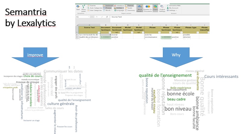
Semantria by Lexalytics
This was the best of three Excel plug-ins at one important task: the identification of multi-word topics. It produces useful multi-word word clouds and works well in French. The word clouds are rather exotic Excel Pivot Charts. As with all Pivot Charts and Pivot Tables, clicking on any element takes you to a new sheet with the corresponding underlying data.
The software performs sentiment analysis and provides a sentiment score. It did a nice job on the “Why?” question and did not do so well with the improvement suggestions. The improvement suggestions varied widely and no software was great at grouping similar multi-word topics together. Humans are much better at this so far.
The screen-captures that are combined in Exhibit 9.11 show the main interface and the clouds for both open-ended questions. The people at Lexalytics have released a version that is specific to survey analysis in late 2016, too late for the study. It currently supports 22 languages.
MeaningCloud
MeaningCloud is a free Excel plug-in available at www.meaningcloud.com. The authors suggest using it for surveys and social media analysis. It does some sentiment analysis and works in French, and of course in English. As supplied, it is quite interesting, but does not classify some responses correctly. By that I mean that some of the positive and negative sentiment categorization is opposite to the sentiments actually expressed.
You are encouraged to build up your own taxonomy. It was clear that if you build a taxonomy for your industry, it should do a good job of correctly categorizing responses. It was not worth investing the necessary time to build an education taxonomy for this single survey.
The image below is a screen capture. If you intend to do multiple surveys in a narrow domain, you may find it worthwhile to build up a taxonomy and the software will be more useful.
 Text2Data
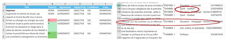
Text2Data is an Excel plug-in that extracts single and multi-word topics and does sentiment analysis. It does not work in French and the screen capture below is from the English translation of the survey responses. The problem with the sentiment analysis here is easy to understand from the screenshot. The sentiment words are shown, but not what they refer to. ‘Outdated chaotic’, OK, but what is outdated and/or chaotic? You have to go back to the individual responses, so the summarization really does not work well. In short, the software was not immediately useful and was not explored in greater depth.
Haven OnDemand NPS analytics
Unfortunately, now that we are in September 2019, this application no longer exists. It was written using the Haven OnDemand cloud-based Application Programming Interfaces (APIs) and was free to use. The code for the application has been open-sourced on Github at https://github.com/hpe-idol/netpromoter. Haven OnDemand was developed in the software division of Hewlett Packard Enterprise. HPE announced that the software division would be merged with UK company Micro Focus during 2017 and set up as an independent entity, 51% owned by HPE. Unfortunately Haven OnDemand did not survive the transition. It still exists behind the firewall, but is no longer publicly available.
In English, Haven OnDemand did the best job of any software investigated, though it did not do as well in French. Since it finished second overall in the study, let’s look at it in a bit more detail.
Haven OnDemand background
Haven OnDemand was a set of cloud-based APIs that could be strung together to create powerful applications. Some were very entertaining. If you search YouTube, you should be able to find a Nerf gun that has been programmed to do facial recognition.
The NPS application used only IDOL functions. IDOL stands for Intelligent Data Operating Layer and came from Autonomy Inc., which was acquired by HP. IDOL is used for analyzing all types of unstructured data, including video, audio, and of course text. It works to some extent in over 100 languages, including Vogon and Klingon. (Software programmers do not get out much and tend to like science fiction. I can relate to that, based on overnight stints in the computer room while I was still a student) The sentiment analysis API that is used in the NPS application works well in 14 languages.
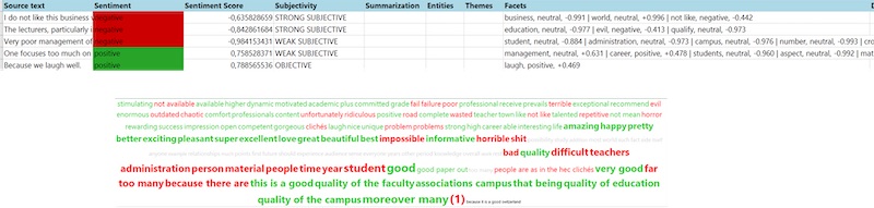
A very partial list of the APIs is below, followed by what the output looked like.
Distinguishing features
Compared to everything else tested, the Haven OnDemand application did three things best:
- It grouped related topics together, even if the words used in the topics are not exact matches.
- It allowed you to exclude single-word topics from your results. Assuming you have sufficient data, this works particularly well in English, not so well in French, Italian and Spanish. The Mandarin tester told me it did an OK job there too, though the concept of a single word is different in Mandarin.
- The bar chart presentation was the easiest to understand of any software tested.
Like all other software tested, it was poor at pronoun handling.
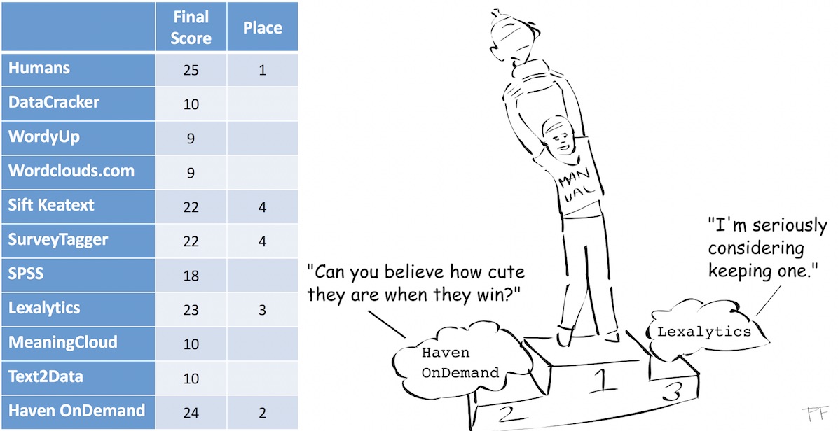
Results
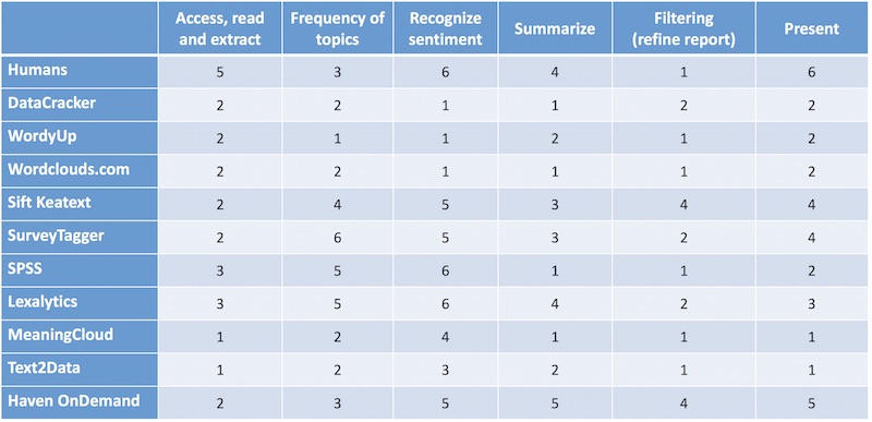
The illustrations below are the scoring tables my daughter used to evaluate the software tested for her project. Since Etuma Feedback Categorizer was tested later, it is not included in the table. In principle, it would score lower than Survey Tagger for access, since it cannot be used without assistance in a demo version, and higher for filtering and presentation.
Guess what? Humans win! We can’t be replaced (yet). We win because we are still better at understanding how to interpret pronouns and give context to what we read. Note that if your survey needs differ from those of the study, your ranking will differ too.
 Next time
The next article will cover an example of commercial software that does indeed satisfy all of the criteria mentioned above.
As is often the case, the above is a slightly-edited version of a chapter in one of our books; in this case Net Promoter – Implement the System All of our books are available in paperback and Kindle formats from Amazon stores worldwide, and from your better book retailers.