NPS (15) – Use direct marketing techniques to improve survey response rates – 15th in the series on NPS
This is the 15th article in a series on the Net Promoter Score and Net Promoter System. The subject this time is the use of classical direct marketing techniques to improve response rates. By classical, well… yes, I do mean ‘old’.
Like most people, I receive lots of survey requests by email. Unlike most people, I don’t just delete them all. I want to learn. What I usually learn is that most survey designers don’t understand even the most basic direct marketing techniques. Here are some that you may want to consider.
Direct marketing reference source
My direct marketing guru is Drayton Bird, author of Commonsense Direct & Digital Marketing. Most of the techniques for getting people to do what you want them to do have not changed since direct marketing was done by sending people things by snail mail. Here are the most critical points:
Personalize
Make your invitation as personal as conceivably possible. Use the person’s first and last name. (It is better to err on the side of formality. There are cultures where using an adult person’s first name only will turn them off. France is a good example.) If you have additional information about them, like the city where they live, the industry in which they work and so on, use that too. Personalization applies at the outbound source as well. If you are doing an overall brand image/relationship survey that is being sent by email to smaller customers and partners, it should go out from the CEO’s mailbox. Product-specific surveys should go out from the product manager’s mailbox and should start with “Good morning Mr. Doe, I am the product manager for the DoubleBubble Jacuzzi you bought recently at Home Depot…”
Single action request
Only ask the person to take a single action. When I was taught direct marketing, I was taught to think of the recipient holding a stack of letters and standing over a waste bin. The first letter asks the person to do A. She puts it in an action stack on her desk. The second one asks her to do B. She puts it in the bin. The third one asks her to do A or B… She thinks “Wow, A or B, which should I do? I can’t decide.” So she drops it in the bin. Like most aspects of direct marketing, this has been studied using A / B testing; the technique where you change only one thing in a marketing piece and measure what happens. While intuition would tell you that giving a person two choices would double the overall response rate, the opposite actually happens. Your overall response rate halves if you give a person two choices rather than asking them to do a single thing. If you give them three choices, response rates drop to a quarter.
Herd instinct
Appeal to herd instinct. The UK government has a partially privatized unit called the ‘Behavioural Insights Team’, generally known as the ‘Nudge unit’. They have convincingly shown that writing to people who are late paying their taxes in a particular way works. Something like, “Almost every company here in the greater Homeville area has paid their taxes on time. In the last year, these taxes have paid for a new playground on Middle St. and the new recycling centre behind the farmers’ market. Please join your fellow citizens in making Homeville a better place to live.” Of course, all that has to be true.
Since you are unlikely to get half the recipients of an email to respond to a survey before sending a reminder, the reminder could say something like, “Acme customers from all over the greater Chicago area have already answered our three-minute survey and are helping us to improve our lawnmowers. Please add your views to theirs to ensure all of Chicago is represented.” Naturally, this requires knowing that that the person does indeed live in that area. Again, the more personal you can make it, the better.
The correct choice of fonts
For some reason, this one is controversial and when I talk about it, I am usually told I am wrong, at least by the people who are being polite. The others use stronger words. The font you use makes a big difference to response rates. You should always use a serif font for body text in your emails or paper forms. Serif fonts are the ones with little hooks on them and with bases on all the vertical strokes. These extra hooks and bases are the serifs.There is a reason 99.999% of all books are written with serif fonts. These fonts are much easier to read.
Most people will recognize Arial as a ‘sans-serif’ font and Times New Roman as a serif font. The serifs give the eye a natural line to follow. Comprehension is much better than with sans-serif fonts because your eye never accidentally skips to the previous or following line. This is not an issue with short headings. Look around you and you will see that most books and magazines have sans-serif fonts for the short headings, and serif fonts for body text. This has been tested repeatedly in direct marketing, especially by Drayton Bird. The common view that this is no longer the case because so many sans-serif fonts are used on web pages is simply wrong.
Place pictures carefully, if at all
Don’t break up your text with pictures. Drayton Bird’s research shows that a high proportion of people won’t read anything below your picture. If you have to have a picture, it should be at the top or bottom, or perhaps to one side. Note that if you are sending emails to a new distribution list, the customers’ email clients may block the display of images.
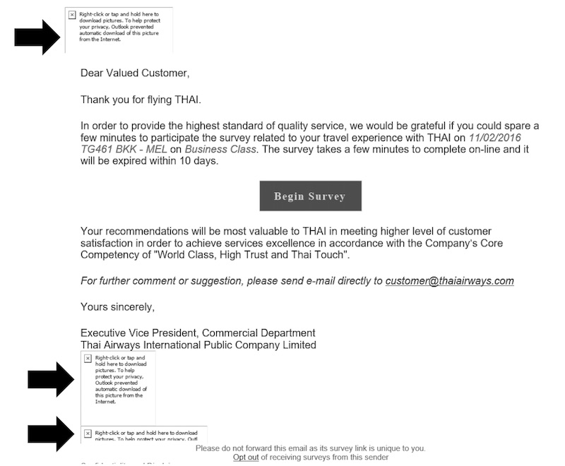
The image below is an example of a survey request I received from Thai Airways. My Outlook client blocked the images, though not the button image, while my iPad mail client displayed it correctly. I can’t resist noting that while they know that I took the flight, they don’t know my name. Did you know that airline slang for passengers is ‘Self-loading freight’? Should I be consoled by the fact that they don’t know the name of the EVP who sent the email either? I suppose I should complete my pickiness by adding that you should spell out dates to avoid confusion. Thai has used the US date format for a European customer.
Reminders
Send a reminder after two days. When you send a survey invitation by email, you will typically get 90% of the responses within 24 hours. Almost nobody files this sort of thing away for later consideration. They either handle it when they see it, or not at all. Only send the reminder to people who have not already responded. If 100 people responded to the first email, my experience suggests that about 65 will answer a second email telling them there are only 24 hours left to provide input.
Incentives
I suppose I should add a word about incentives. Incentives can improve response rates, but should not be used. Way back in early 1994, I ran a project to launch a Digital-Microsoft software subscription service across Europe. It was a precursor to Microsoft’s launch of a volume licensing program. The main technique used was direct-response advertising. One country project leader (OK, it was Norway) ignored my advice and included an incentive. The incentive was to be entered in a draw for two tickets to the soccer World Cup in the USA that year. Norway had qualified, to their surprise, and the promotion was a spectacular success. Surprisingly, it almost got me fired. A certain Steve Ballmer was leading sales at Microsoft at the time, and he apparently became irate that we had taken 20% market share in Norway with the promotion. The incumbent Microsoft resellers were unhappy and complained bitterly. My boss’s boss’s boss (John Rando at the time) had signed the agreement with Microsoft, came to see me, determined that everything was OK and defended me. Whew! In any case, it proved that incentives work in direct marketing, and have consequences.
Incentives produce positive bias
While that is an extreme case of an incentive, there is a more general issue that has to do with human nature. Providing incentives seems to positively bias responses to surveys. Humans have difficulty believing they can win something in a random prize draw if they give very negative feedback. So, if your intent is just to improve the metrics but not to gain accurate insights, go ahead and use incentives.
A/B testing
Direct marketing introduced the concept of A/B testing. This is where you change just one thing in an email (for example) and compare the results randomly with emails that do not have the change. If you want to test the effect of using a person’s name on response rates, randomly pick half your email list and start with “Dear customer” while starting the other half with “Dear Mr. Doe”. Try another experiment the following time, like using the person’s name in the subject line of the email.
Conclusion
This is not a complete list of everything you can do to improve response rates. It is just the subset that has to do with direct marketing techniques. Feel free to disagree with the above, or add your own suggestions below.
Looking forward
The next article will be the last one on improving response rates. It includes a number of proven ideas that don’t fit into a single category. One of the five is the one that I have personally found to have the strongest positive effect.
As is often the case, the above is a slightly-edited version of a chapter in one of our books; in this case Net Promoter – Implement the System All of our books are available in paperback and Kindle formats from Amazon stores worldwide, and from your better book retailers.


 And of course this well-known quote:
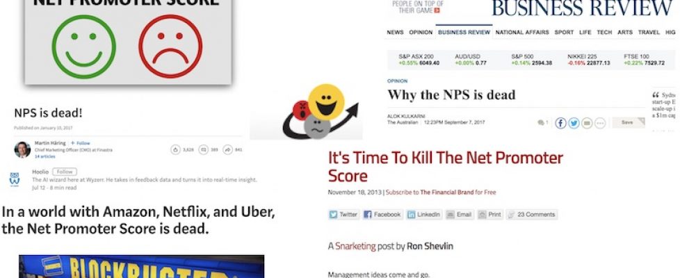
 For reasons I won’t go into at the moment I have had to research what those who do not support NPS have been writing over the years. Here are some of the objections I know about and what I think of each. If you have others in mind, let me know and I will provide my perspective.

